Up to 8% of the population has some degree of colorblindness, which is a significant portion of the people who may be using your DataBlocks. Basically, even if accessibility is not required by your institution (and it often is), what it comes down to is that if you want people to be able to use your content, you need to make it accessible.
In this post, we’ll be discussing some best practices and techniques that can be leveraged within Argos to design dashboards that are easier to use for people with disabilities. The information on accessibility design principles is based off of the WCAG 2.0 level A and AA guidelines, located at https://www.w3.org/TR/WCAG20/.
Form Layout
Most screen readers read documents linearly, from top to bottom, left to right. If you keep this in mind, you can group logical information so that it will be read in an intelligent order, rather than relying on the visual presentation to convey meaning. For example:
- Place a descriptive title or heading at the top of your forms, and at the top of any logical sections so that users know what they are looking at.
- Consider placing labels above or to the left of objects, instead of underneath or to the right. The Labeled By property discussed later in this post can also help with this for certain object types.
- Buttons that perform actions based on entered parameters should appear after the parameter fields, not above them. This allows users to enter parameters and then tab to the button, instead of forcing them to jump back to the top of the page to proceed. You may also use the Tab Order property to control the navigation where a button in a different location is required.
- If you have objects grouped together on a panel, ensure that the tab order for those objects makes sense and does not send the user back and forth between different, unrelated areas.
Button and Link Text
Screen reader users may not be able to understand the purpose of a button or link when it is taken out of context of the visual presentation or surrounding text. When tabbing to a button or link, any previous text content is skipped. A good solution for this is to use descriptive text for the button or link. For example, instead of labeling your button “Go”, you might call it “Retrieve Data.” For a hyperlink, this could say “Launch Google” instead of “click here.”
Choice of Objects
Use the correct type of dashboard object for your intended purpose whenever possible. For example, if you want a button, use a button object instead of a shape with a label on it. Buttons are keyboard-accessible by default (the Tab Stop property is automatically set to Yes for you), whereas shapes and labels are not.
Color and Contrast
For normal sized text, you should choose appropriate colors that have a contrast ratio of at least 4.5:1 with the background color. Large-scale text (generally considered 18 point or higher) can have a contrast ratio of 3:1. There are many free contrast checking programs available, such as Colour Contrast Analyser, that make it very easy to select foreground and background colors and verify that they have sufficient contrast. Some of these programs will also show you what your color selections look like to people with varying types of colorblindness.
One thing to keep in mind is that you should not rely on color as the sole means of conveying information. For example, if you are using colored icons to indicate the status of something, make sure that the icons also have text on them or have different shapes or some other way for users to differentiate their meanings.
Object Properties Affecting Accessibility
Most Argos objects have properties than can be used to improve accessibility. Where provided, you should use these properties to ensure the best experience possible for your users. Please note that the Accessible Text and Labeled By properties discussed below were added in Argos version 5.4, so if you’re on an earlier version you may want to talk to your MAPS administrator about upgrading!
Accessible Text
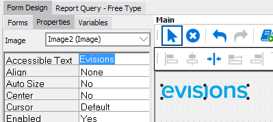
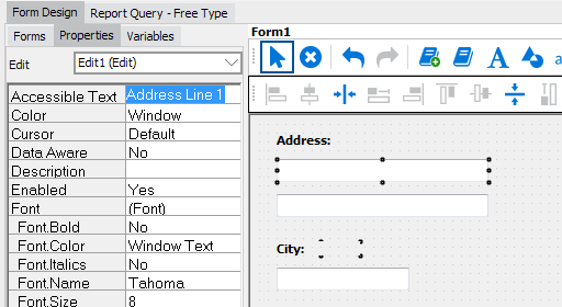
Some form objects have an Accessible Text property, which can be used to provide a text alternative to objects that contain visual information, such as images, charts, OLAP cubes, and shapes. It also works with edit boxes and list/multi-column list boxes. When a screen reader user navigates the dashboard in the Web Viewer, this text is read to the user, helping them to identify the content if they are unable to see it.
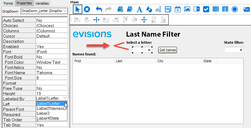
Labeled By
The Labeled By property is a drop-down field that allows you to choose an existing text object on the dashboard to assign as the label for this object. When using a screen reader in the Web Viewer, the selected text label will be read to the user when they navigate to the object. When designing a DataBlock with accessibility in mind, it is a best practice to assign labels for all form input fields, particularly edit boxes, date edits, and drop-down controls. This property can also be used with checkbox and radio button groups, list and multi-column list boxes (note: does not work with list boxes using JAWS/IE), and memo fields.
Tab Stop
The Tab Stop property is what allows users to navigate to that object using the keyboard. It should be set to Yes for objects that users should be able to interact with, such as form fields, buttons, and list boxes. If Tab Stop has been set to No for an interactive object, keyboard users may be unable to access it, potentially preventing them from using your DataBlock.
Tab Order
The Tab Order property controls the navigation order when using the keyboard to tab through dashboard objects. The tab order should ideally match the visual tab order on the screen, and should make sense to the user when hearing the fields in sequence. The default tab order is the order that fields were added to the dashboard, so you may need to adjust this as you add, remove, or reposition form elements. Argos will attempt to intelligently adjust the tab order of other objects if you specify a number that is already in use.
Conclusion
Accessibility doesn’t have to be a lot of work. If you understand the basic principles and know what tools are available to you, it’s fairly straightforward to design content with the goal of making it as accessible as possible. Not only will this significantly help some of your users, but designing for accessibility can also improve your dashboards for everyone else, since you will be creating well-organized layouts that are easy on the eyes and simple to use. Particularly when entering parameters, your users will very much appreciate being able to fill out all of the required information without taking their hands off the keyboard.
Keep an eye out from us for further updates on this topic. Evisions is working on additional accessibility-related enhancements that will appear in future versions of Argos. To be notified when new features are available, you can subscribe to updates for specific products on our forums. And as always, if you have any questions, comments, or feedback on these features or would like to see a specific feature added or prioritized, please let us know.


Alwyn:
Great points. As the Argos Administrator and Lead DataBlock Designer, I’ve shared this with our Group of 14 Departmental DataBlock Designers.
We are attempting to meet WCAG 2.0 AA Requirements. I’ve updated my Dashboards with the key points in your Blog (Labeled By, Tab Order & Stop, Color, Contrast, Font and Size).
However, when evaluating my Dashboards with a compliance tool like aXe, several WCAG 2.0 AA requirements are not met.
I’ve created multiple Support Tickets requesting enhancements to meet these requirements.
– zooming and scaling
– HTML Language attribute
– ARIA parent roles
I’d be interested to hear Evisions’ plans to meet these WCAG 2.0 AA requirements.
Also, will only the Argos Web Viewer (AWV) be WCAG 2.0 AA compliant or will the Argos Client be as well?
Thanks,
Mike C.
Hi Mike,
I’m glad to hear that the article was helpful for you. The recent enhancements were the first step toward our goal of making Argos fully compliant with Section 508 and WCAG 2.0 level AA. We will be making further improvements with each successive release of Argos, so definitely keep an eye out for the release announcements.
We’re focusing our efforts on the Web Viewer to start with, for two reasons. First, because there are a larger number of Report Viewers compared with Report Writers and DataBlock Designers, and we want to begin with issues that will have the most benefit to the largest number of users. Second, we are dealing with some technology limitations on the Argos client side that are going to require significant changes to parts of the software. In the interest of providing at least one easily accessible method of accessing Argos reports, we’ll be able to do this faster via the Web Viewer. Long-term, the end goal we are working toward is to have all products fully compliant.
We are currently in the process of updating the Argos VPAT to reflect the recent changes to Section 508. We are also creating a separate VPAT for the Web Viewer. Both of these documents should be available early next year and will provide detailed information on the known issues on our roadmap.
I’ve added you to our existing issues AR-4169 (Add lang attribute to HTML tag in AWV), AR-5264 and MAPS-1413 (meta tag prevents user scaling in AWV/eLauncher), and AR-4222 (For multi-column list boxes in AWV, associate data cells with their column headers) so you will be notified when they are resolved.
With regard to the meta tag preventing user scaling, all major browsers ignore this attribute and allow users to zoom in as expected. It definitely needs to get updated, but should not affect users running current versions of IE, Firefox, Chrome, or Safari.
I hope this was helpful– please let us know if you have further questions. In particular, if you have any feedback from end users regarding product accessibility, it would be great to hear which items they’d like to see addressed first.
Best regards,
Alwyn